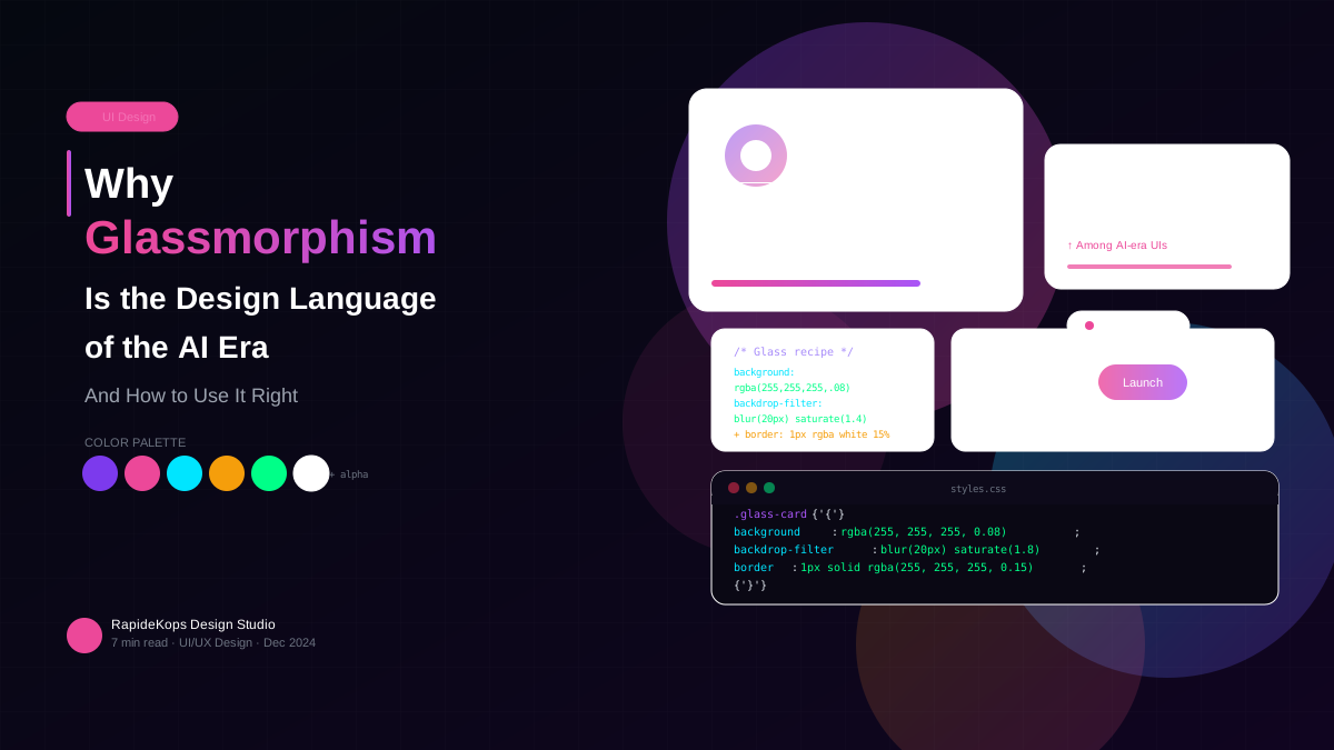
When Apple introduced frosted glass in iOS 7, designers called it gimmicky. Twelve years later, glassmorphism has become the visual language of the most ambitious technology products in the world. It is a response to what AI-native interfaces need to communicate: depth, intelligence, layering, and calm authority.
What Glassmorphism Actually Is
At its core, glassmorphism creates the illusion of translucent surfaces using backdrop blur, subtle borders, and carefully managed opacity. It makes UI panels feel like physical objects suspended in space — suggesting that something is happening behind the interface even when the screen is still.
That is precisely why it resonates with AI products. The blur is a visual metaphor for the computational depth behind every output the system generates.
The Five Rules We Follow
Dark backgrounds only. Glassmorphism is a dark-mode-first technique. On light backgrounds, the blur reads as muddy rather than luminous. Start with a near-black base and build upward.
One neon accent per surface. Each glass panel gets a single coloured border or glow — not three. Restraint separates premium from garish.
Layer your backdrop blur, not your content. backdrop-filter: blur() should live on the panel, not elements inside it. Nesting blur layers kills performance on mid-range devices.
Motion should be subtle and purposeful. Floating panels, slow orbital animations, and gentle pulse effects reinforce the sense of intelligence. If everything moves, nothing stands out.
Typography earns its weight. On dark glass, use font-weight 600+ for anything under 14px. Avoid pure white — rgba(255,255,255,.9) reads sharper and less harsh than #ffffff on dark glass.
What Comes Next
The next evolution is contextual — surfaces that change their blur, opacity, and accent colour based on content state. The glass is not just aesthetic. It is information.